Tatiana Padilla

Data Analyst
View the Project on GitHub TatianaPadillab/Data-Analyst-Portfolio
Data Analyst
Technical Skills: Python, SQL, Power Bi, R, Tableau, JavaScript, Microsoft Office
Education
-
M.S., Information Technology Management Universidad Cooperativa de Colombia (2023-Present) -
B.S., Industrial Engineering Universidad del Magdalena (2016-2021) -
High School Diploma with Focus in information technology I.E.D. Madre Laura (2005-2015)
Work Experience
Planning Analyst @ Universidad Cooperativa de Colombia (2023 - Present)
- Building reports and dashboards for campus executives, evaluating the level of institutional achievements and providing strategic recommendations. Close collaboration with various departments for data collection, tracking action plans to assess progress on different KPIS.
Quality Assurance Analyst @ C.I. Técnicas Baltime de Colombia (2021 - 2022)
- Created interactive dashboards and detailed reports for presenting data insights in a clear and accessible manner to stakeholders. Play a supportive role in building infrastructure for processing data from various sources, providing a holistic view of company performance and informing next best actions. Using Power BI to present data findings visually to enhance understanding and decision-making.
Projects
Adventure Works - Quarterly Sales Performance Dashboard Using Microsoft Power BI
This project was for Adventure Works, a multinational bicycle manufacturer. The goal was to provide the executive board and sales management team with insights into quarterly sales performance to support strategic decision-making for the upcoming quarter. I developed a detailed dashboard in Power BI Desktop to offer an overview of quarterly sales performance for the executive board. A separate, interactive report was created for the sales management team to explore sales data in greater detail. The analysis highlighted trends in sales by region, category, and salesperson, and summarized key takeaways for both the board of directors and the sales management team.
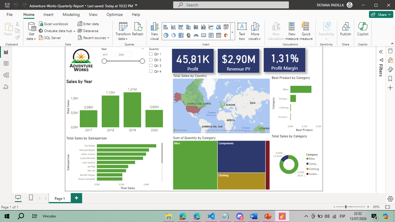
By reviewing the dataset and selecting appropriate visualizations, I was able to present a clear and engaging narrative of the sales performance. The final report was published on the Power BI service, where the executive board could access a high-level dashboard, while the sales management team could delve into a granular report for more detailed insights.
See more: HERE
Comprehensive Analysis of National Test Results Using Excel
Excel was used to gather and analyze national test results of the students, comparing data across different cities, states, institutions, and programs. The data was meticulously organized and cleaned for accuracy, with key metrics such as averages and standard deviations calculated using various statistical functions. Pivot tables and charts were created to facilitate a clear comparative analysis, providing a visual representation of the results.
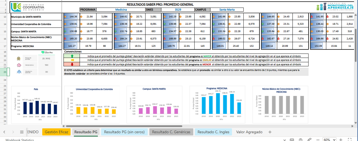
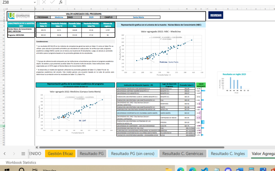
This comprehensive analysis and visualization enabled stakeholders to easily understand the data and make informed decisions. The final Excel file was shared for real-time collaboration, ensuring all team members had access to the same information and insights.
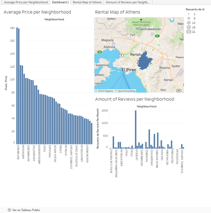
Average price of listings in Athenas Using Tableau
These charts were made using data from Airbnb to represent the average price of listings in the area of Athens and a map to represent the concentration of listings in the city.
The Development Bank in Mexico - Financial Analysis Using Power BI
In this project, Microsoft Power BI was used to perform a detailed financial analysis for the Development Bank in Mexico. The analysis covered key financial indicators such as assets, liabilities, equity, portfolio, reserves, physical assets, net income, profit margin, operational efficiency, ROA, ROE, IMOR, and ICOR.
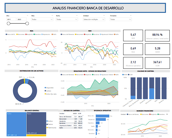
By creating comprehensive reports and interactive dashboards, I could provide stakeholders with clear insights into the bank’s financial performance. The visualizations and data models allowed for an in-depth examination of trends and facilitated data-driven decision-making.
See more: HERE
Minnesota Department of Transportation - Traffic Patterns Dashboard Using Tableau
This dashboard was made for monitoring traffic patterns. The objective was to gain insights into traffic volume throughout the year, organized by year, month, week, day, and hour, as well as traffic volume under different weather conditions and on various holidays. Understanding these traffic patterns would help the department make crucial infrastructure decisions, ensuring that future construction projects do not disrupt traffic flow.
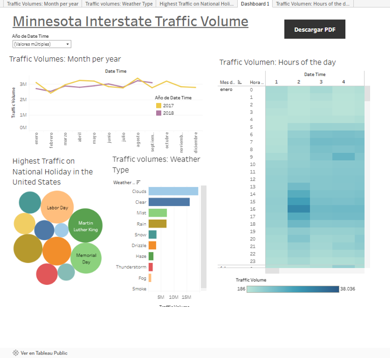
The Metro Interstate Traffic Volume Data was loaded into Tableau Public and created comprehensive visualizations. These visualizations provided clear insights into how traffic patterns varied across different times and conditions. The project equipped the Minnesota Department of Transportation with the tools and information necessary to plan and execute infrastructure projects with minimal impact on drivers, thereby improving overall traffic management and planning.
See more: HERE
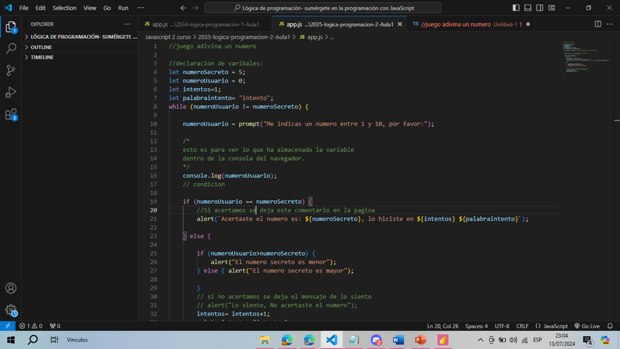
Guess the Secret Number Game Application Using JavaScript
This application was developed as a simple game where the user is asked to enter a number between 1 and 10. The program provides feedback on whether the entered number is lower or higher than the secret winning number.

See more: HERE
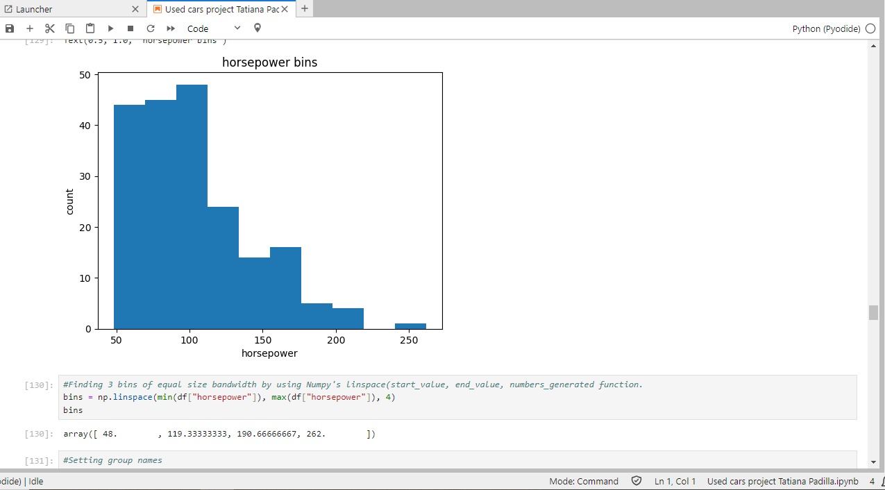
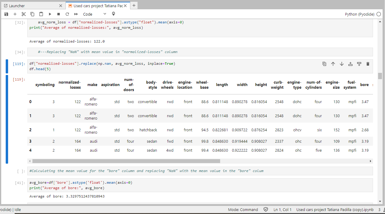
Used Cars Pricing - Data Wrangling Using Python in JupyterLite
In this project, I utilized data wrangling techniques to transform raw data into a structured format suitable for in-depth analysis using Python. The project involved the following key steps: -Handling Missing Values: Identified and addressed missing values to ensure data completeness. -Correcting Data Formatting: Standardized data formats to maintain consistency across the dataset. -Data Standardization and Normalization: Applied standardization and normalization techniques to improve the interpretability and comparability of the data. The cleaned and preprocessed dataset was then analyzed using various visualization techniques, including histograms, to uncover patterns and insights. All steps were documented and executed within a JupyterLite notebook, showcasing the transformation process and the resulting improvements in data quality and usability.
See Code here: HERE